Tableau
These are notes I made during the visualisation part of the Kubrick Data Engineering training course. In Tableau; creating basic tables, sorting, and formatting are all highly intuitive so these notes will cover the background and some of the less conventional techniques available.
The Formation of Tableau
Back in around 2002 a Ph.D student Chris Stolte turned his thesis into a business which has evolved into Tableau. The software runs on VizQL which is similar to SQL but it follows a visual syntax powered by dragging and dropping.
Calculated Fields
Caculated fields are data fields that are derived from other fields in the dataset. These other fields are either partitioning (bucket data) or addressing (define direction).
For example a calculation may be to sum by a category (partitioning) and this could be done over time (addressing) to give the sum of prices by category over time.
Calculated fields can be used for more specific aggregation. To aggregate by customer then sales for example:
{INCLUDE [Customer Name]:AVG([Sales])}
To aggregate by sales but not by state:
{EXCLUDE [State]:AVG([Sales])}
Then, to show which states have sales higher or lower than average you can dual axis AVG([Sales]) with the following:
[Sales] - [Avg excl state]
Some good examples of calculated field use can be found in this blog post which includes graphs and code examples.
Level of Detail & Filters
Level of detail (LOD) expressions allow you to compute aggregations that are not at the level of the visualization. This is very common and useful for comparing a value to an average for the category for example (think SQL grouping).
When calculating on unaggregated fields the level of detail remains at row-level meaning the calculation is done for each row, for example [Sales] / [Profit]. Dragging this new field into a worksheet automatically aggregate it over the view (default is SUM()).
In contrast, if you define a view-level calculation yourself such as SUM(Sales) / SUM(Profit) and drag that into the sheet it will create an aggregate function which looks like AGG(SUM(Sales) / SUM(Profit)).
The level of detail of the view determines the number of marks in your view. When you add a level of detail expression to the view, Tableau must reconcile two levels of detail—the one in the view, and the one in your expression. If the expression is coarser than the view then the view will still show it’s finer level of detail but replicate the expressions values across each sub-category. If the expression is finer than the view then the expression must be aggregated.
The coarseness or fineness of a calculated field is determined by the expression type;
INCLUDE- Expression always at the same or finer than the view, values are never replicated and must be aggregatedFIXED- Expression could be same, finer, or coarser than the view, aggregation depends on the dimensions in the viewEXCLUDE- Expression always the same or coarser than the view, values will be labelled withATTRto show they are coarse and any aggregation is ignored
There are 6 levels of filter in Tableau that are applied in the following order:
- Extract Filters - Applied when importing data
- Data Source Filters
- Context Filters
-
- (
FIXED)
- (
- Dimension Filters - Equivalent of
WHERE -
- (
INCLUDE / EXCLUDE)
- (
- Measure Filters - Equivalent of
HAVING - Table Calc Filters - Applied after table calculations
Examples of different types of LOD expression are explained in this blog post.
Set Actions
Set Actions are used to add interactivity to a dashboard. The simplest use is forcing graphical elements from one sheet to be highlighted when their related field is selected in another sheet. More complex set actions are introduced in this blog post.
Mapping
Tableau has some smart features for working with geographic information, there are two general cases where geographic data is used.
The first case is where the input file has latitude and longitude explicitly defined. In this case these columns will be designated as geographic types when imported.
The second case is where the input file has some kind of alternate geographic information such as a postcode, city name, country name, etc. When these data types are imported they may have to be set as geographic types, Tableau will then generate coordinate values for that point.
Tableau can aggregate geographic data to different levels by selecting the dimension detail.
Dual axis mapping
Dual axis settings allow us to add multiple layers of data to one chart or map. This is especially useful when dealing with multiple spatial data sources. Without a workaround generated and non-generated co-ordinates cannot be combined on an axis.
Dual axis mapping can be enabled just by selecting the dual axis setting on a geographic row or column. To dual axis a single data column for different levels of detail you can copy a coordinate pill and dual axis it to itself.
There are small variations in how to dual-axis map depending on the source data, they’re all explained in this blog post.
File Types
- .twb - Tableau workbook without data included
- .twbx - Tableau workbook with data included
- .hyper - Data file including geographic types
Spatial Files
Tableau has built in geographic functionality, recognizing both geographic files and relating certain strings to borders as well as boundaries down to postcodes (for UK and USA at least). However, if using non-standard boundaries (historical, LSOA, non-UK/USA admin areas) then external spatial files must be used to define areas.
- Shapefiles (.shp) - Esri shapefiles can be used in any GIS program
- GeoJSON (.json) - Spatial data in JSON format
- KML (.kml) - Google Earth files
Any spatial file contains geometry which consist of polygons and attributes which are values stored in a table (or JSON). Tableau can also handle isochrones which are lines of equal travel time from a starting point.
Extracted Data
Extracting a data source in Tableau saves it as a .tde or .hyper file meaning it can be accessed when the database is offline or inaccessible. Another advantage is that an extract of data is stored as a columnar version of the data. One popular storage protocol which uses columnar storage is Parquet developed by Google.
A typical data table can be represented with columns and rows:
Clustered index storage effectively stores fields row-wise:
To find values in a column using a clustered index requires either scanning or seeking using a B-Tree index.
Columnar storage stores fields by column: sq
Columnar storage is also known as vertical partitioning or homogeneous data. This allows for much less expensive seeking, aggregating, and compression. Columnar storage and Parquet are explained more fully in this blog post.
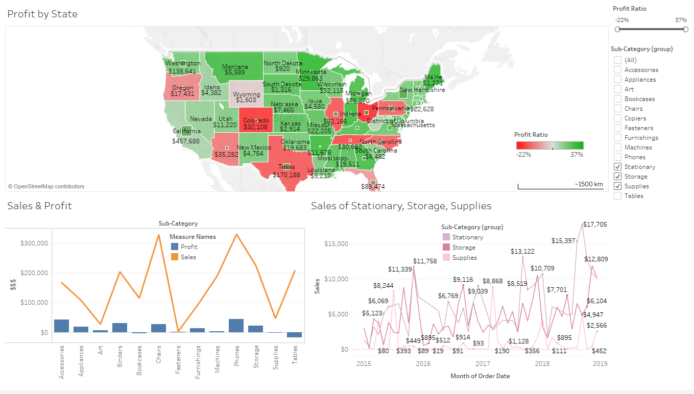
Example Dashboards
My first dashboard used sample sales data supplied by Tableau:
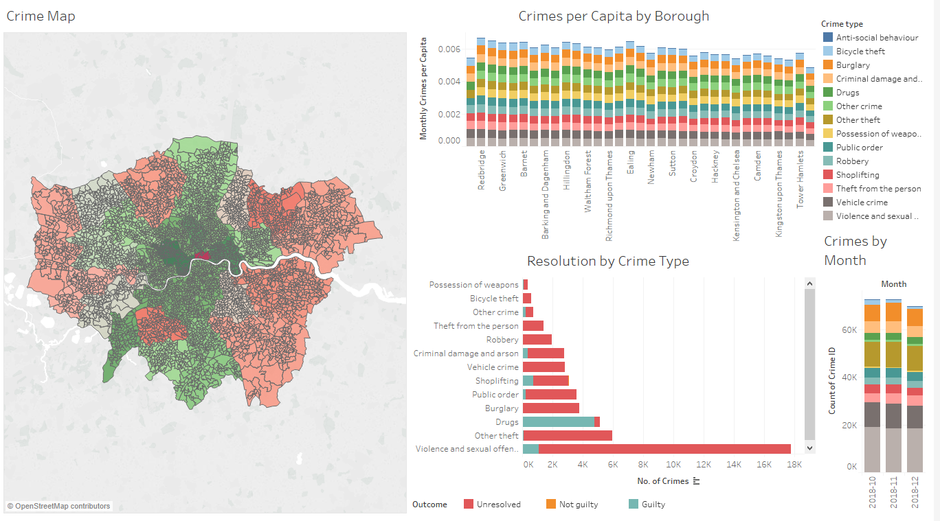
Next I built a simple dashboard of crime in London combined with socio-economic data by LSOA:
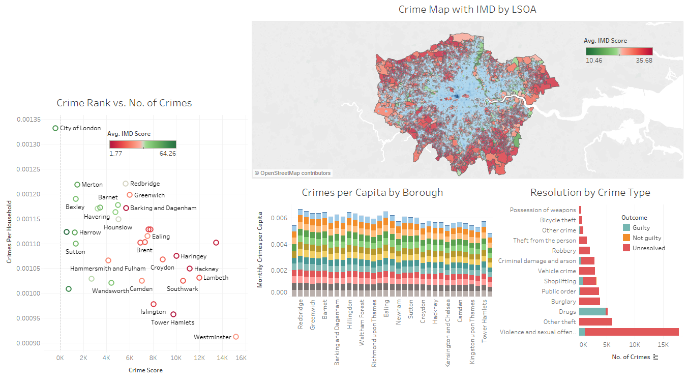
I analysed the crime data slightly further by including more detailed external LSOA data such as crime rank and IMD (Indices of Multple Deprivation):
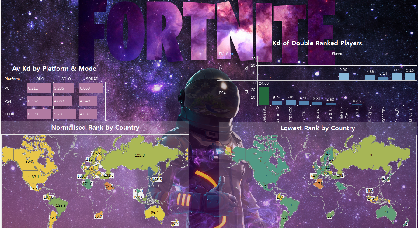
I then experimented with images and colours on top ranking Fortnite players data (it’s beautiful, I know):
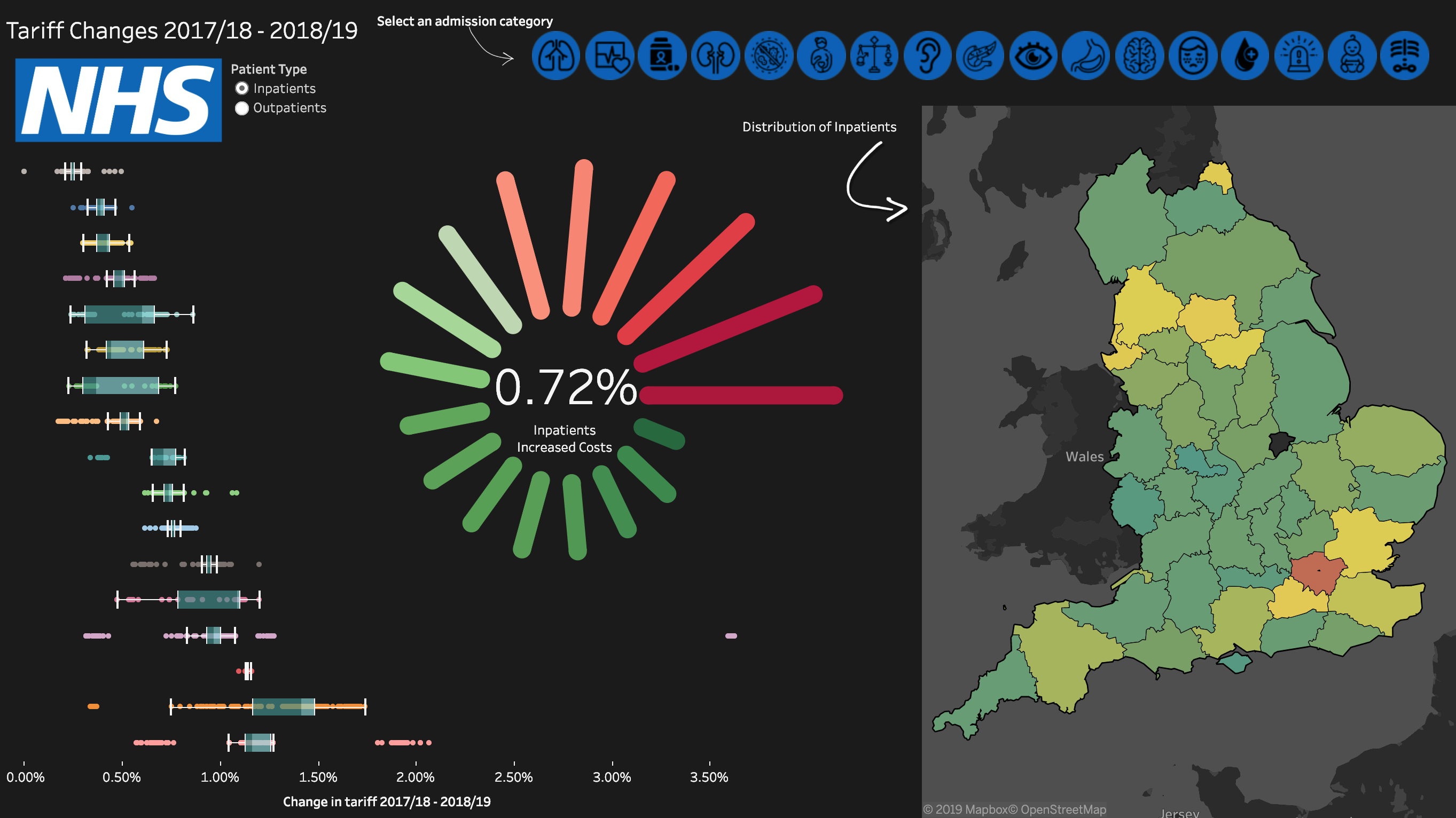
I wrote about my first real Tableau project, analysing NHS tariff changes, here.