Python #5: Matplotlib
This is the fifth in a series of Python notes I made during the Kubrick Data Engineering training course.
#1: Basics
#2: Advanced
#3: Scraping
#4: Pandas
#5: Matplotlib
Basic Matplotlib
Matplotlib is an advanced plotting library for Python, it has a lot of functionality so I will just cover the minimum here.
Interfaces
There are two main ways of setting up a plot area called interfaces; MATLAB Style Interface (Stateful) and Object Oriented Interface (Non-Stateful).
import matplotlib.pyplot as plt
import numpy as np
import pandas as pd

# MATLAB interface example
plt.figure()  # Create figure area

plt.subplot(2,1,1)  # Move to subplot 1 (row,col,num)
plt.plot(x, np.sin(x))

plt.subplot(2,1,2)  # Move to subplot 2
plt.plot(x, np.cos(x))


# Object oriented interface example
fig, ax = plt.subplots(2,1)  # 2 rows, 1 col
ax[0].plot(x, np.sin(x))   # Call plot function on axis
ax[1].plot(x, np.cos(x))
The rest of this post will use the object oriented interface.
Limits & Labels
# Limit axes:
ax.set_xlim(2,6)
ax.set_ylim(-2,2)

# Label axes & title:
ax.set_xlabel('x_values')
ax.set_ylabel('y_values')
ax.set_title('Title')
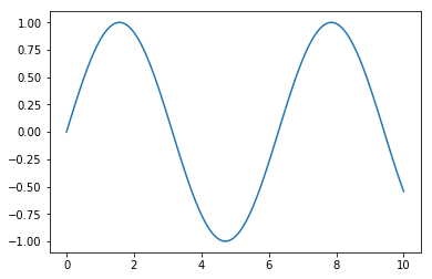
Line Plots
The simplest plot in Matplotlib is a line graph with no styling.
x = np.linspace(0, 10, 100)  # 0-10 with 100 points linearly spaced
plt.plot(x,np.sin(x))
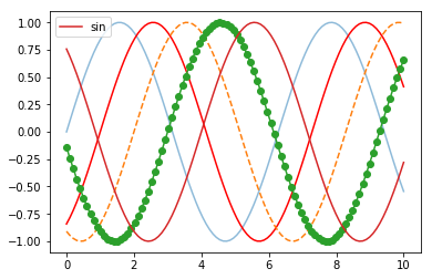
Styling can be applied to each line on a plot
fig, ax = plt.subplots()

ax.plot(x, np.sin(x), alpha=0.5)  # Transparency

ax.plot(x, np.sin(x-1), color='red')  # Colour

ax.plot(x, np.sin(x-2), linestyle='--')  # Dashed

ax.plot(x, np.sin(x-3), marker='o')  # Point marker

ax.plot(x, np.sin(x-4), label='sin')  # Legend
ax.legend()
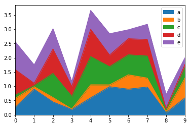
df.plot.area()
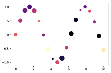
Scatter Plots
x = np.linspace(0, 10, 20)

fig, ax = plt.subplots()
ax.scatter(x, np.sin(x),
           sizes=np.random.uniform(30, 300, 20),  # Random marker sizes
           c = np.random.uniform(30, 300, 20),    # Random marker colours
           cmap = 'magma')  # Marker colour map
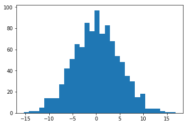
Histograms
1-dimensional histogram of normal distribution:
x = np.random.normal(0, 5, 1000) # 1000 points, normal dist, mean=0, variance=5

fig, ax = plt.subplots()
_ = ax.hist(x, 30)  # Set bins= to change number of bins
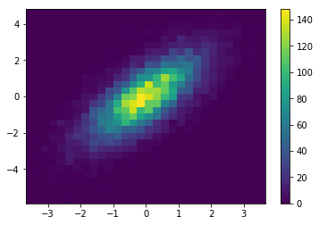
2-dimensional histogram of normal distribution:
mean = [0, 0]
cov = [[1,1], [1,2]]
data = np.random.multivariate_normal(mean, cov, 10000)

fig, ax = plt.subplots()
hist_data = ax.hist2d(data[:,0], data[:,1], bins=30)
plt.colorbar(hist_data[3], ax=ax)
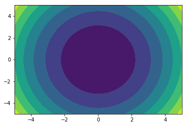
Contour Plots
x = np.linspace(-5, 5, 50)
y = np.linspace(-5, 5, 50)

X, Y = np.meshgrid(x, y)
Z = 2*X**2 + Y**2

fig, ax = plt.subplots()
ax.contourf(X, Y, Z)
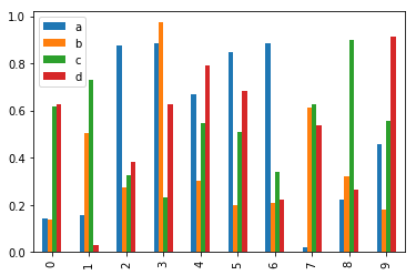
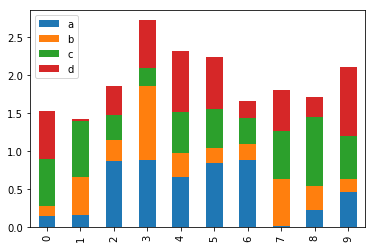
Multiple Bar Plots
df2 = pd.DataFrame(np.random.rand(10, 4), columns=list('abcd'))
df2.plot.bar()
df2.plot.bar(stacked=True)
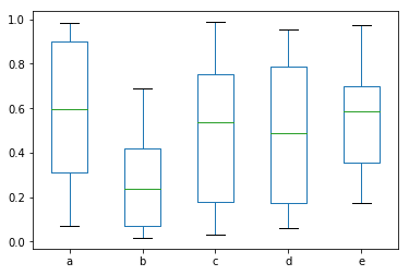
Box Plots
df = pd.DataFrame(np.random.rand(10, 5), columns=list('abcde'))
df.plot.box()
Pandas Plotting
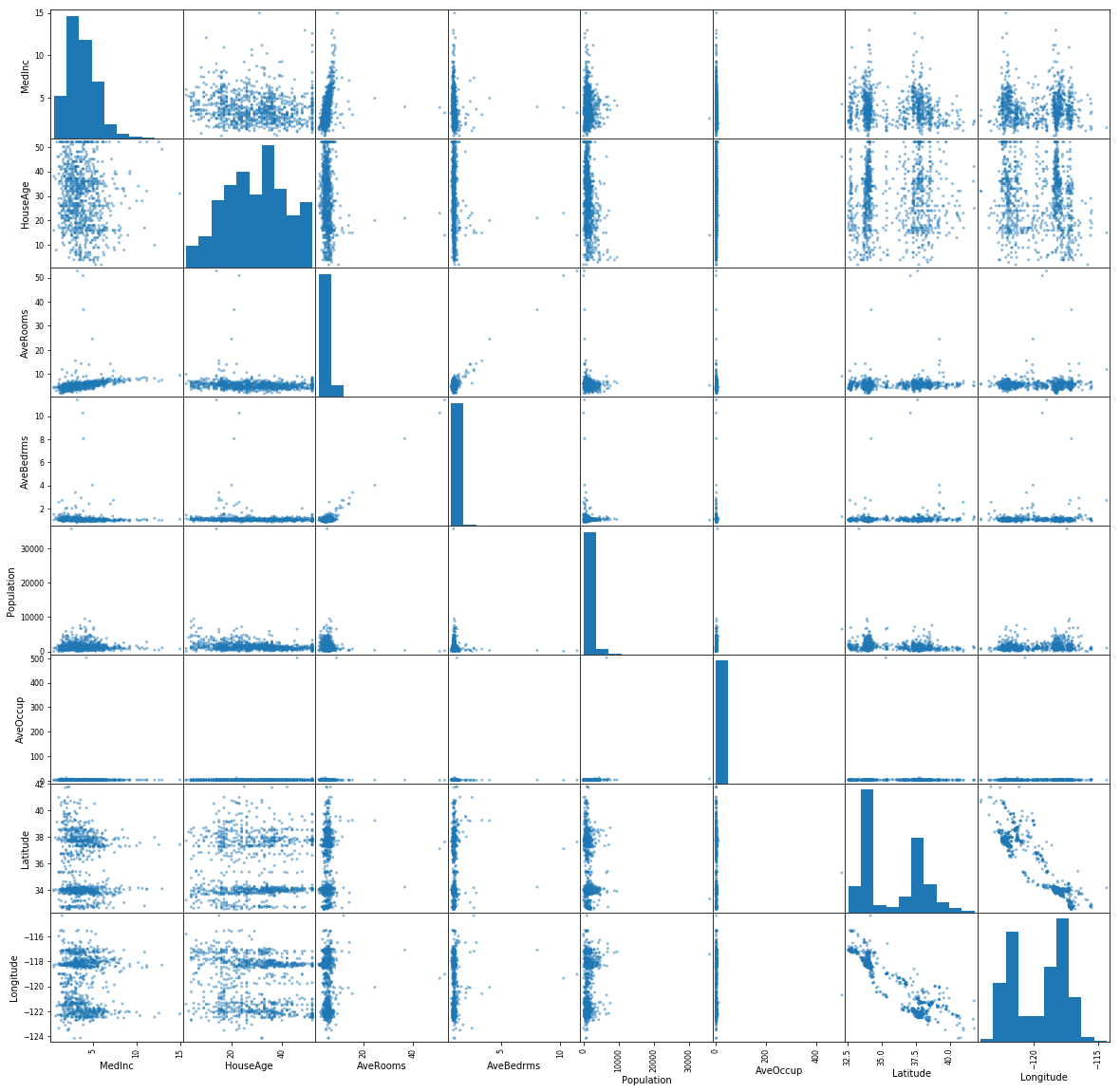
Part of Pandas plotting is the scatter matrix which shows a scatter graph of every variable in a DataFrame against every other variable. This is very useful for initial probing and visual analysis of a dataset.
from sklearn.datasets import fetch_california_housing
from pandas.plotting import scatter_matrix

data = fetch_california_housing()
df = pd.DataFrame(data['data'], columns = data['feature_names'])

_ = scatter_matrix(df.sample(n=1000), figsize=(20,20))